HASPmota ~
This feature is included in tasmota32-lvgl.bin
Starting from v14.5.0.2, HASPmota automatically starts if a file pages.jsonl is present
Tasmota happily supports the openHASP compatible format, known as HASPmota. This format allows you to describe rich graphics interfaces using simple JSON templates. The HASPmota support in Tasmota leverages the power of LVGL and the Berry language, but you don't need to code or learn the LVGL API to use it.
This feature is heavily inspired from @fvanroie's openHASP project.
Running HASPmota~
HASPmota, like OpenHASP, relies of describing the elements to be displayed in a simple JSONL file. JSONL (JSON Lines) is a file format where each line is a valid JSON value. The default file name is pages.jsonl.
When a file pages.jsonl is present in the file system, HASPmota is automatically started without any additional code needed (since v14.5.0.2, previously you needed to start HASPmota in autoexec.be).
HASPmota auto-start is triggered after autoexec.be is executed, so you have the opportunity to start HASPmota yourself, or initialize any sensor or components autoexec.be time. You can also use a different name than pages.jsonl and start HASPmota at any time of your convenience.
Running HASPMota manually~
If you need to start HASPmota manually, you can use the following code in autoexec.be:
import haspmota
haspmota.start()         # manually start HASPmota using default 'pages.jsonl' file
You can pass an additional parameter with the name of the template file:
import haspmota
haspmota.start("my_template.jsonl")
Gallery of widgets~
The jsonl file used to display the widgets can be found widget demo JSONL file
Minimal requirements~
Hardware: HASPmota is supported on all ESP32 variants, and requires a display configured with universal display (using display.ini or autoconf). When they are correctly configured, you should see a splash screen at startup.
Currently PSRAM is strongly recommended to run HASPmota if you want to use images and external fonts. Boards without PSRAM can do basic HASPmota.
Firmware: HASPmota is included in tasmota32-lvgl firmwares, you don't need any additional .tapp file.
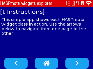
Quick tour~
You can see HASPmota in action in a couple of minutes.
Upload tamota_demo.tapp to your file system. The easy way is to use the following command in Tasmota console:
UrlFetch https://raw.githubusercontent.com/arendst/Tasmota/development/tasmota/berry/haspmota/haspmota_demo.tappRestart 1to restart- Enjoy
You should see the following screen, and click on buttons to switch to the second screen:

Understanding the template~
HASPmota automatically loads the template from a file named pages.jsonl. This file contains JSON Lines, i.e. a single JSON document per line. Each line describes an element on the screen. Elements are grouped into pages.
Page 0 contains objects that are displayed on all screens. They are typically used for headers and menus.
The lines below define the header label (red background) and the clock and wifi widgets.
{"page":0,"comment":"---------- Upper stat line ----------"}

{"id":11,"obj":"label","x":0,"y":0,"w":320,"pad_right":90,"h":22,"bg_color":"#D00000","bg_opa":255,"radius":0,"border_side":0,"text":"Tasmota","text_font":"montserrat-20"}

{"id":15,"obj":"lv_wifi_arcs","x":291,"y":0,"w":29,"h":22,"radius":0,"border_side":0,"bg_color":"#000000","line_color":"#FFFFFF"}
{"id":16,"obj":"lv_clock","x":232,"y":3,"w":55,"h":16,"radius":0,"border_side":0}
The lines below describe the 3 buttons at the bottom, and their respective actions.
{"comment":"---------- Bottom buttons - prev/home/next ----------"}
{"id":101,"obj":"btn","x":20,"y":210,"w":80,"h":25,"action":"prev","bg_color":"#1fa3ec","radius":10,"border_side":0,"text":"\uF053","text_font":"montserrat-20"}
{"id":102,"obj":"btn","x":120,"y":210,"w":80,"h":25,"action":"back","bg_color":"#1fa3ec","radius":10,"border_side":0,"text":"\uF015","text_font":"montserrat-20"}
{"id":103,"obj":"btn","x":220,"y":210,"w":80,"h":25,"action":"next","bg_color":"#1fa3ec","radius":10,"border_side":0,"text":"\uF054","text_font":"montserrat-20"}
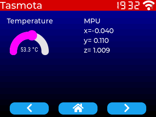
Page 1 is the default page, and contains different widgets types: labels and arc. The values are changed at runtime via Tasmota's rule system, see below for details.
{"page":1,"comment":"---------- Page 1 ----------"}
{"id":0,"bg_color":"#0000A0","bg_grad_color":"#000000","bg_grad_dir":1,"text_color":"#FFFFFF"}

{"id":2,"obj":"arc","x":20,"y":65,"w":80,"h":100,"border_side":0,"type":0,"rotation":0,"start_angle":180,"end_angle":0,"start_angle1":180,"value_font":12,"value_ofs_x":0,"value_ofs_y":-14,"bg_opa":0,"text":"--.-°C","min":200,"max":800,"val":0,"val_rule":"ESP32#Temperature","val_rule_formula":"val * 10","text_rule":"ESP32#Temperature","text_rule_format":"%2.1f °C"}

{"id":5,"obj":"label","x":2,"y":35,"w":120,"text":"Temperature","align":1}

{"id":10,"obj":"label","x":172,"y":35,"w":140,"text":"MPU","align":0}
{"id":11,"obj":"label","x":172,"y":55,"w":140,"text":"x=","align":0,"text_rule":"MPU9250#AX","text_rule_format":"x=%6.3f","text_rule_formula":"val / 1000"}
{"id":12,"obj":"label","x":172,"y":75,"w":140,"text":"y=","align":0,"text_rule":"MPU9250#AY","text_rule_format":"y=%6.3f","text_rule_formula":"val / 1000"}
{"id":13,"obj":"label","x":172,"y":95,"w":140,"text":"z=","align":0,"text_rule":"MPU9250#AZ","text_rule_format":"z=%6.3f","text_rule_formula":"val / 1000"}
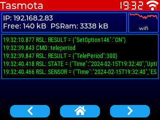
Page 2 contains custom widgets as Berry code. These widgets are imported within haspmota_widgets.tapp
{"page":2,"comment":"---------- Page 2 ----------"}
{"id":0,"bg_color":"#0000A0","bg_grad_color":"#000000","bg_grad_dir":1,"text_color":"#FFFFFF"}

{"comment":"---------- Wifi status ----------"}
{"id":20,"obj":"lv_wifi_graph","x":257,"y":25,"w":60,"h":40,"radius":0}
{"id":21,"obj":"lv_tasmota_info","x":3,"y":25,"w":251,"h":40,"radius":0}
{"id":22,"obj":"lv_tasmota_log","x":3,"y":68,"w":314,"h":90,"radius":0,"text_font":12}
Finally, the following line allows to run arbitrary Berry code.
{"comment":"--- Trigger sensors every 2 seconds ---","berry_run":"tasmota.add_cron('*/2 * * * * *', def () var s = tasmota.read_sensors() if (s) tasmota.publish_rule(s) end end, 'hm_every_5_s')"}
The code trigger a read of sensors every 2 seconds and publish the JSON result to be parsed by the rule engine.
tasmota.add_cron('*/2 * * * * *', def () var s = tasmota.read_sensors() if (s) tasmota.publish_rule(s) end end, 'hm_every_5_s')
HASPmota reference~
Integration to Berry~
objects as p<x>b<y>~
Each HASPmota widget is mapped to a global variable of name p<x>b<y>. Example: p1b10. Such objects can be directly used via their attributes.
Example:
p1b10.x += 10
p1b10.text = "Hello"
print(p1b10.w)
pages as p<x>~
Pages objects are mapped to a global variable of name p<x>.
Changing pages can be done with p2.show()
move to page programmatically~
Use haspmota.page_show(<action>) with a parameter action taking one of the following: next, prev, back, p<n>.
haspmota.page_show('next')      # move to next page
haspmota.page_show('prev')      # move to previous page
haspmota.page_show('back')      # move to home page
haspmota.page_show('p3')        # move to page 3
additional parsing~
HASPmota parses all lines from the file pages.jsonl. You can dynamically add new objects as JSON with haspmota.parse(<json>). This functions takes a single json line. It is highly recommended to specify the page id in the json, otherwise the object is added to the current page.
Pages~
Pages object are identified by object if 0. Example:
{"page":1,"id":0,"bg_color":"#0000A0","bg_grad_color":"#000000","bg_grad_dir":1,"text_color":"#FFFFFF"}
Internally HASPmota pages are implemented with LVGL screens, i.e. a parent object.
Page 0 is a special page that is displays over every screens. It is the perfect place to put navigation menus. It is implement as lv.layer_top().
Page 1 is always present and the default page.
| Attributes specific to page | Details |
|---|---|
prev | (int) target page number when pressing PREV button |
next | (int) target page number when pressing NEXT button |
home | (int) target page number when pressing HOME button |
| And generally all object attributes |
Classes of widgets~
Attribute "obj" can take the following values:
| HASPmota Class | Embedded LVGL class |
|---|---|
obj | lv.obj |
btn | lv.btn |
switch | lv.switch |
checkbox | lv.checkbox |
label | lv.label |
spinner | lv.spinner |
line | lv.line |
img | lv.img |
dropdown | lv.dropdown |
roller | lv.roller |
btnmatrix | lv.buttonmatrix |
bar | lv.bar |
scale | lv.scale |
slider | lv.slider |
arc | lv.arc |
textarea | lv.textarea |
led | lv.led |
chart | lv.chart |
cpicker | lv.colorwheel (ported from LVGL8 to LVGL9) |
spangroup | lv.spangroup |
span | lv.span |
msgbox | lv.msgbox |
qrcode | lv.qrcode |
tabview | lv.tabview |
You can also import custom widget as long as they inherit from lv.obj and the class name matches the module name.
Example: "obj":"lv_wifi_graph" will trigger the following: - import lv_wifi_graph - instantiation of lv_wifi_graph(parent) object - if successful, it can be used like a typical HASPmota object
Attributes~
New in Tasmota v13.4.0.4, sizes can be expressed in percentage of the screen.
Values in pixels can be expressed in percentage instead of absolute value. Just suffix the attribute name with %. Example: "h%:100 instead of "h":320. Percentage values can only be set (written to); when you read back a size, it is always in pixels.
When using Berry scripting, h% is not a valid attribute name so you need to use the special syntax:
p10b20.('h%') = 100
Below are the standard attributes:
| Attribute name | LVGL equivalent | Details |
|---|---|---|
comment | Ignored | |
meta | any | Any data, can be retrieved from Berry code with p<x>b<y>.meta |
page | 0 to 15 Parent screen object | Page id for the current object. If not present, takes the value of the current page |
id | 0..255 | Id number of the object. Id 0 means the entire page.A global berry object is created with name p<page>b<id> (ex: p1b10) |
obj | widget class | Class of the widget (see above). If not present, the entire JSON line is ignored |
action | "next", "prev", "back" or "p<x>" | Switch to page when the object is touched |
x | x | X coordinate of top left corner |
y | y | Y coordinate of top left corner (Y is pointing down) |
h | height | Height in pixels |
w | width | Width in pixels |
hidden | flag lv.OBJ_FLAG_HIDDEN | Object is hidden (bool) |
enabled | flag lv.OBJ_FLAG_CLICKABLE | Object is touch/clickable (bool) |
click | flag lv.OBJ_FLAG_CLICKABLE | Synonym of enabled. Object is touch/clickable (bool) |
toggle | flag lv.STATE_CHECKED | When enabled, creates a toggle-on/toggle-off button. If false, creates a normal button. TODO check if bool or string |
radius | style_radius | Radius of rounded corners |
bg_opa | style_bg_opa | Opacity: 0 is transparent, 255 is opaque |
bg_color | style_bg_color | Color of background, format is #RRGGBB |
bg_grad_color | style_bg_grad_color | Color of background gradient |
bg_grad_dir | style_bg_grad_dir | Gradient direction0: none1: Vertical (top to bottom) gradient2: Horizontal (left to right) gradient |
border_side | style_border_side | Borders to be displayed (add all values)0: none1: bottom2: top4: left8: right15: full (all 4) |
border_width | style_border_width | Width of border in pixels |
border_color | style_border_color | |
line_color | style_line_color | Color of line |
line_width | style_line_width | |
line_width1 | style_arc_width | Sets the line width of an arc indicator part |
pad_left | style_pad_left | Left padding in pixels |
pad_right | style_pad_right | Right padding in pixels |
pad_top | style_pad_top | Top padding in pixels |
pad_bottom | style_pad_bottom | Bottom padding in pixels |
pad_all | style_pad_all | Sets all 4 padding values at once (Write-only) |
Attributes related to text content~
| Attribute name | LVGL equivalent | Details |
|---|---|---|
text | text | Sets the inner text of the object. If the native LVGL object does not support text (like lv.btn), a lv.label sub-object is automatically created. |
value_str | text | Synonym of text |
align | style_text_align | Set alignment for text0 or "left": lv.TEXT_ALIGN_LEFT1 or "center": lv.TEXT_ALIGN_CENTER2 or "right": lv.TEXT_ALIGN_RIGHT |
text_font | style_text_font | Sets the font name and size for the text. If int, the default font is robotocondensed_latin1 and the parameter sets the sizeIf string, the font is in the form <font_name>-<font_size>, example: montserrat-20 or in the form A:<font_file> to load a binary font from the file-system. |
value_font | style_text_font | Synonym of text_font |
text_color | style_text_color | Sets the color of text |
text_decor | style_text_decor | Sets the text decorator, can be ORed0: none1 underline2: strike-through |
text_opa | style_text_opa | Sets the text opacity0: transparent255: opaque |
text_letter_space | style_text_letter_space | Set the letter space in pixels |
text_line_space | style_text_line_space | Set the line space in pixels. |
long_modelabel_mode | set_long_mode | Usually the size of the label is automatically expanded to the text size. If the width or height are explicitly set, the following policies are applied:"expand": expand to sizebreak or 0: (lv.LABEL_LONG_WRAP) Wrap too long lines"dots" or 1: (lv.LABEL_LONG_DOT) Replaces the last 3 characters from bottom right corner of the label with dots"scroll" or 2: (lv.LABEL_LONG_SCROLL) If the text is wider than the label scroll it horizontally back and forth. If it's higher, scroll vertically"loop" or 3: (lv.LABEL_LONG_SCROLL_CIRCULAR) If the text is wider than the label scroll it horizontally continuously. If it's higher, scroll vertically."crop" or 4: (lv.LABEL_LONG_CLIP) Simply clip the parts of the text outside the label. |
value_color | style_text_color | Synonym of text_color |
value_ofs_x | x of sub-label | Sets the X offset in pixels within the object |
value_ofs_y | y of sub-label | Sets the Y offset in pixels within the object |
text_rule | Link the text to a Tasmota rule, see below | |
text_rule_formula | Link the text to a Tasmota rule, see below | |
text_rule_format | Link the text to a Tasmota rule, see below |
Attributes related to values~
| Attribute name | LVGL equivalent | Details |
|---|---|---|
min | range | Set the minimum value of range (int) |
max | range | Set the maximum value of range (int) |
val | value | Set the value (int) |
val_rule | Link a value to a Tasmota rule, see below | |
val_rule_formula | Link a value to a Tasmota rule, see below |
flex (flex layout)~
HASPmota originally supported only absolute positions and sizes in pixels, which made it challenging to handle different screen sizes. LVGL, on the other hand, provides a flexbox layout. This layout can arrange items into rows or columns (tracks), handle wrapping, adjust the spacing between the items and tracks, and dynamically adjust the size of the items to fill the remaining space, while respecting their minimum and maximum width and height constraints. Flex layout in LVGL is a set of attributes that can be assigned to any object, such as "obj". To make it easier to create transparent and invisible Flex containers, HASPmota has introduced the flex classes.
Class flex defines a transparent object used as a container for LVGL flex layout. It is for example used to place buttons in the lower part of the screen in HASPmota demo.
{"id":100,"obj":"flex","x":0,"y%":80,"h%":20,"w%":100,"flex_main_place":3}
Default values used for flex:
| Default attribute | Description |
|---|---|
"obj":"flex" | flex is a subclass of obj |
"pad_all":0 | No padding |
"radius":0 | Rectangle object (no rounded corners) |
"border_width":0 | No border |
"margin_all":0 | No margin |
"bg_opa":0 | Background transparent |
"h%":100 | Default height of 100%, can be changed |
"w%":100 | Default width of 100%, can be changed |
{"id":100,"obj":"flex","x":0,"y":188,"h":50,"w%":100,"flex_main_place":3}
  # [sub-objects with "parentid":100]
| General flex attributes | Description |
|---|---|
flex_flow | Sets the layout flow0: (lv.FLEX_FLOW_ROW) Place the children in a row without wrapping1: (lv.FLEX_FLOW_COLUMN) Place the children in a column without wrapping4: (lv.FLEX_FLOW_ROW_WRAP) Place the children in a row with wrapping5: (lv.FLEX_FLOW_COLUMN_WRAP) Place the children in a column with wrapping8: (lv.FLEX_FLOW_ROW_REVERSE) Place the children in a row without wrapping but in reversed order9: (lv.FLEX_FLOW_COLUMN_REVERSE) Place the children in a column without wrapping but in reversed order12: (lv.FLEX_FLOW_ROW_WRAP_REVERSE) Place the children in a row with wrapping but in reversed order13: (lv.FLEX_FLOW_COLUMN_WRAP_REVERSE) Place the children in a column with wrapping but in reversed order |
flex_main_place | Determines how to distribute the items in their track on the main axis.0: (lv.FLEX_ALIGN_START) means left on a horizontally and top vertically (default)1: (lv.FLEX_ALIGN_END) means right on a horizontally and bottom vertically2: (lv.FLEX_ALIGN_CENTER) simply center3: (lv.FLEX_ALIGN_SPACE_EVENLY) items are distributed so that the spacing between any two items (and the space to the edges) is equal (does not apply to flex_track_place) |
flex_cross_place | Determines how to distribute the items in their track on the cross axis. E.g. if the items have different height place them to the bottom of the track Same values as flex_main_place |
flex_track_place | Determines how to distribute the tracks Same values as flex_main_place except 3, 4 and 5 |
flex_grow (on child) | Make one or more children fill the available space on the track. When more children have grow parameters, the available space will be distributed proportionally to the grow values. |
pad_row | Sets the padding between the rows |
pad_column | Sets the padding between the columns |
Children object can also influence the flex layout with the folowing attributes:
| Children flex attributes | Description |
|---|---|
flex_in_new_track | (bool) When true force item into a new line |
flex_grow | Make one or more children fill the available space on the track. When more children have grow parameters, the available space will be distributed proportionally to the grow values. See LVGL documentation for more details. |
fixed (fixed layout)~
Fixed layout allows to create a transparent object in which you can place fixed position and fixed size object. This is equivalent to obj but fully transparent.
It can be used as an alternative to flex above as a container used in flex layout.
label~
Example:
{"id":10,"obj":"label","x":0,"y":30,"w":240,"h":24,"text":"[1. Instructions]","text_font":"montserrat-20"}
Attributes are all related to text content (see above).
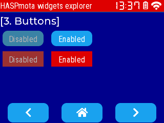
btn~
Example:
{"id":11,"obj":"btn","x":5,"y":60,"w":80,"h":30,"radius":10,"text":"Disabled","enabled":false}
{"id":12,"obj":"btn","x":100,"y":60,"w":80,"h":30,"radius":10,"text":"Enabled"}

{"id":13,"obj":"btn","x":5,"y":100,"w":80,"h":30,"radius":0,"text":"Disabled","enabled":false,"bg_color":"#DD0000"}
{"id":14,"obj":"btn","x":100,"y":100,"w":80,"h":30,"radius":0,"text":"Enabled","bg_color":"#DD0000"}
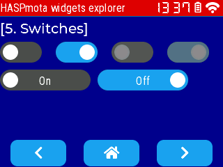
switch~
Example:
{"id":11,"obj":"switch","x":0,"y":60,"w":60,"h":30}
{"id":12,"obj":"switch","x":80,"y":60,"w":60,"h":30,"toggle":true}
{"id":13,"obj":"switch","x":160,"y":60,"w":60,"h":30,"enabled":false}
{"id":14,"obj":"switch","x":240,"y":60,"w":60,"h":30,"toggle":true,"enabled":false}

{"id":21,"obj":"switch","x":0,"y":100,"w":130,"h":30,"text":"On"}
{"id":22,"obj":"switch","x":140,"y":100,"w":130,"h":30,"toggle":true,"text":"Off"}
| Attribute name | LVGL equivalent | Details |
|---|---|---|
toggle | true or false: read or change the value of the switch | |
bg_color | Color of the indicator when the switch is Off | |
bg_color11 | Color of the indicator when the switch is On | |
bg_color20 | Color of the knob | |
text_color | Color of the text when the switch if Off | |
text_color01 | Color of the text when the switch if On | |
radius20 | Radius of the knob. |
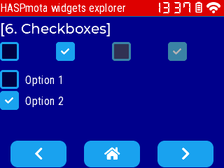
checkbox~
Example:
{"id":11,"obj":"checkbox","x":0,"y":60,"w":60,"h":30,"text":""}
{"id":12,"obj":"checkbox","x":80,"y":60,"w":60,"h":30,"toggle":true,"text":""}
{"id":13,"obj":"checkbox","x":160,"y":60,"w":60,"h":30,"text":"","enabled":false}
{"id":14,"obj":"checkbox","x":240,"y":60,"w":60,"h":30,"text":"","toggle":true,"enabled":false}
| Attribute name | Details |
|---|---|
toggle | true or false: read or change the value of the checkbox |
bg_color | Color of the indicator when the checkbox is Off |
bg_color11 | Color of the indicator when the checkbox is On |
text_color | Color of the text when the checkbox if Off |
text_color01 | Color of the text when the checkbox if On |
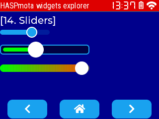
slider~
Example:
{"id":11,"obj":"slider","x":0,"y":60,"w":100,"h":10,"val":65}
{"id":12,"obj":"slider","x":0,"y":90,"w":180,"h":20,"bg_color":"#000044","bg_color10":"#00FF00","bg_color20":"#FFFFFF","val":40,"bg_opa":255,"border_color":"#1FA3EC","border_width":2,"pad_all":6,"radius":6}
{"id":13,"obj":"slider","x":0,"y":130,"w":180,"h":15,"bg_color":"#4F4F4F","bg_opa":255,"bg_color10":"#00FF00","bg_color20":"#FFFFFF","val":26,"min":-20,"max":30,"bg_grad_color10":"#FF4400","bg_grad_dir10":2}
| Attribute name | LVGL equivalent | Details |
|---|---|---|
bg_color | Color of the background (inactive) part of the slider, by default dimmed with bg_opa | |
bg_color10 | Color of the active part of the slider | |
bg_color20 | Color of the indicator | |
border_width | Width of the overall border, 0 by default | |
pad_all | Padding of the overall border, 0 by default | |
bg_grad_color10 | End color of the active part of the slider when gradient is enabled | |
bg_grad_dir10 | Gradient direction0: none1: Vertical (top to bottom) gradient2: Horizontal (left to right) gradient | |
min | (int) Minimum value | |
max | (int) Maximum value | |
val | (int) Current value |
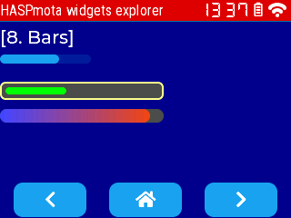
bar~
Example:
{"id":11,"obj":"bar","x":0,"y":60,"w":100,"h":10,"val":65}
{"id":12,"obj":"bar","x":0,"y":90,"w":180,"h":20,"bg_color":"#4F4F4F","bg_color10":"#00FF00","val":40,"bg_opa":255,"border_color":"#FFFF88","border_width":2,"pad_all":6,"radius":6}
{"id":13,"obj":"bar","x":0,"y":120,"w":180,"h":15,"bg_color":"#4F4F4F","bg_opa":255,"bg_color10":"#4444FF","val":26,"min":-20,"max":30,"bg_grad_color10":"#FF4400","bg_grad_dir10":2}
| Attribute name | LVGL equivalent | Details |
|---|---|---|
bg_color | Color of the background (inactive) part of the slider, by default dimmed with bg_opa | |
bg_color10 | Color of the active part of the slider | |
border_width | Width of the overall border, 0 by default | |
pad_all | Padding of the overall border, 0 by default | |
bg_grad_color10 | End color of the active part of the slider when gradient is enabled | |
bg_grad_dir10 | Gradient direction0: none1: Vertical (top to bottom) gradient2: Horizontal (left to right) gradient | |
min | (int) Minimum value, inherited from parent scale if parentid refers to a scale | |
max | (int) Maximum value, inherited from parent scale if parentid refers to a scale | |
val | (int) Current value |
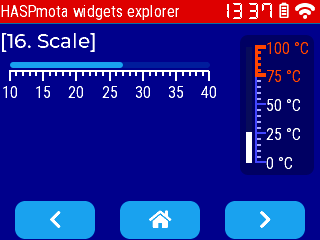
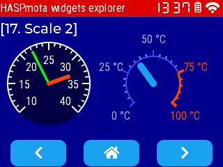
scale, scale_section, scale_line~
Example:
{"id":11,"obj":"scale","x":10,"y":60,"w":200,"h":30,"min":10,"max":40,"total_tick_count":31,"major_tick_every":5,"label_show":true,"line_width":2,"line_width10":2,"line_width30":2,"length10":10,"length30":5,"pad_top":10}
  {"id":12,"obj":"bar","parentid":11,"y":-8,"w%":100,"h":6,"val":27}

{"id":22,"obj":"scale","x":240,"y":35,"w":74,"h":140,"min":0,"max":100,"mode":4,"total_tick_count":21,"major_tick_every":5,"label_show":true,"line_color":"#4444FF","line_color10":"#4444FF","line_color30":"#AAAAFF","line_width":2,"line_width10":2,"line_width30":2,"length10":10,"length30":5,"text_src":["0 °C", "25 °C", "50 °C", "75 °C", "100 °C"],"bg_color":"#000044","bg_opa":127,"pad_left":16,"radius":8,"pad_ver":12}
  {"id":23,"obj":"scale_section","parentid":22,"min":75,"max":100,"line_color":"#FF4400","line_width":3,"line_color10":"#FF4400","line_width10":4,"text_color10":"#FF4400","line_color30":"#FF4400","line_width30":3}
  {"id":24,"obj":"bar","parentid":22,"x":-10,"h%":100,"w":6,"radius":0,"radius10":0,"bg_color":"#4F4F4F","bg_color10":"#FFFFFF","val":27}
{"id":21,"obj":"scale","x":10,"y":60,"w":120,"h":120,"min":10,"max":40,"mode":8,"bg_opa":255,"radius":32767,"clip_corner":true,"label_show":true,"total_tick_count":31,"major_tick_every":5,"length10":10,"length30":5,"angle_range":270,"rotation":135,"arc_width":2,"line_width10":2,"line_width30":2,"length10":10,"length30":5}
  {"id":22,"obj":"scale_line","parentid":21,"line_color":"#00FF00","line_width":4,"line_rounded":true,"needle_length":50,"val":22}
  {"id":23,"obj":"scale_line","parentid":21,"line_color":"#FF4400","line_width":6,"line_rounded":true,"needle_length":30,"val":33}

{"id":31,"obj":"scale","x":180,"y":80,"w":80,"h":80,"min":0,"max":100,"mode":16,"bg_opa":0,"label_show":true,"total_tick_count":21,"major_tick_every":5,"text_src":["0 °C", "25 °C", "50 °C", "75 °C", "100 °C"],"arc_color":"#4444FF","line_color10":"#4444FF","line_color30":"#AAAAFF","text_color":"#AAAAFF","arc_width":2,"line_width10":2,"line_width30":2,"length10":10,"length30":5}
  {"id":32,"obj":"scale_section","parentid":31,"min":75,"max":100,"arc_color":"#FF4400","arc_width":3,"line_color10":"#FF4400","line_width10":4,"text_color10":"#FF4400","line_color30":"#FF4400","line_width30":3}
  {"id":33,"obj":"scale_line","parentid":31,"line_color":"#1FA3EC","line_width":10,"line_rounded":true,"needle_length":30,"val":37}
Note: there is no current val on the scale object. It must be done with a second bar object for linear scale or with a scale_meter sub-object for circular scale.
scale attribute | Details |
|---|---|
mode | Set scale mode0: lv.SCALE_MODE_HORIZONTAL_TOP1: lv.SCALE_MODE_HORIZONTAL_BOTTOM2: lv.SCALE_MODE_VERTICAL_LEFT4: lv.SCALE_MODE_VERTICAL_RIGHT8: lv.SCALE_MODE_ROUND_INNER16: lv.SCALE_MODE_ROUND_OUTER |
min | (int) Minimum value |
max | (int) Maximum value |
total_tick_count | Set the number of total ticks |
major_tick_every | Set a major tick being every Nth ticks |
line_width | Set the line width of the scale line |
arc_width | Set the line width of the scale line (for circular scale) |
line_width10 | Set the line width of the major ticks |
line_width30 | Set the line width of the minor ticks |
line_color | Set the line color of the scale line |
arc_color | Set the line color of the scale line (for circular scale) |
line_color10 | Set the line color of the major ticks |
line_color30 | Set the line color of the minor ticks |
length10 | Set the length of the major ticks |
length30 | Set the length of the minor ticks |
label_show | (bool) Show or hide the labels |
options | (array of string) Labels for major ticks. It is not necessary to end with an empty string. |
angle_range | Set the angular range of a circular scale (in degrees 0..360) |
rotation | Set the angular offset from the 3 o'clock position (clock-wise, in degrees 0..360) |
You can define sub-scales to have a different rendering on the scale using a sub-object scale_section
{"id":13,"obj":"scale_section","parentid":12,"min":75,"max":100,"line_color":"#FF4400","line_width":3,"line_color10":"#FF4400","line_width10":4,"text_color10":"#FF4400","line_color30":"#FF4400","line_width30":3}
scale_section attribute | Details |
|---|---|
parentid | Set to the id of the scale it belongs to |
min | (int) Minimum value of the sub-section |
max | (int) Maximum value of the sub-section |
line_width | Set the line width of the scale line |
arc_width | Set the line width of the scale line (for circular scale) |
line_width10 | Set the line width of the major ticks |
line_width30 | Set the line width of the minor ticks |
line_color | Set the line color of the scale line |
arc_color | Set the line color of the scale line (for circular scale) |
line_color10 | Set the line color of the major ticks |
line_color30 | Set the line color of the minor ticks |
length10 | Set the length of the major ticks |
length30 | Set the length of the minor ticks |
For circular scales, you can define zero or more line indicators with sub-objects scale_line
{"id":22,"obj":"scale_line","parentid":21,"line_color":"#00FF00","line_width":4,"line_rounded":true,"needle_length":50,"val":22}
scale_line attribute | Details |
|---|---|
parentid | Set to the id of the scale it belongs to |
val | (int) The value of the indicator line in the scale (between min and max) |
line_width | Set the line width of the scale line |
line_color | Set the line color of the scale line |
line_rounded | (bool) Rounds both ends of the line |
needle_length | Length of the line |
For linear scales, you can just use a bar sub-object. It inherits min and max values from the parent scale object.
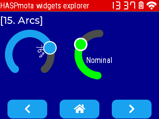
arc~
Example:
{"id":11,"obj":"arc","x":10,"y":60,"w":100,"h":100,"min":-20,"max":40,"val":26,"text":"76%","label_to_angle":-20}
{"id":12,"obj":"arc","x":150,"y":60,"w":100,"h":120,"arc_color10":"#00FF00","bg_color20":"#00FF00","val":65,"text":"Nominal","angle":-40,"border_width20":3,"border_color20":"#FFFFFF","end_angle":310}
| Attribute name | LVGL equivalent | Details |
|---|---|---|
start_angle | bg_start_angle | Start angle of the arc background. Angles are in degrees in 0..360] range.Zero degrees is at the middle right (3 o'clock) of the object and the degrees are increasing in clockwise direction. |
end_angle | bg_end_angle | End angle of the arc background. |
start_angle1 | start_angle | Start angle of the arc indicator. |
end_angle1 | end_angle | End angle of the arc indicator. |
rotation | rotation | Offset to the 0 degree position |
type | mode | Sets the arc mode0: lv.ARC_MODE_NORMAL1: lv.ARC_MODE_REVERSE2: lv.ARC_MODE_SYMMETRICAL |
arc_color10 | Sets the color of the arc indicator | |
border_width20 | Border width of the indicator, 0 by default | |
border_color20 | Border color of the indicator | |
bg_color20 | Color of the indicator | |
text | Sets the text of the label, centered by default, can be turned with label_to_angle | |
label_to_angle | rotate_obj_to_angle | Rotates the label to the current value, and sets an offset in pixels (positive is towards the outer, negative towards the inner) |
pad_top2 | style_pad_top | Top padding for lv.PART_KNOB part |
pad_bottom2 | style_pad_bottom | Bottom padding for lv.PART_KNOB part |
pad_left2 | style_pad_left | Left padding for lv.PART_KNOB part |
pad_right2 | style_pad_right | Right padding for lv.PART_KNOB part |
pad_all2 | style_pad_all | Set all 4 padding for lv.PART_KNOB part (write-only) |
radius2 | style_radius | Radius for lv.PART_KNOB part |
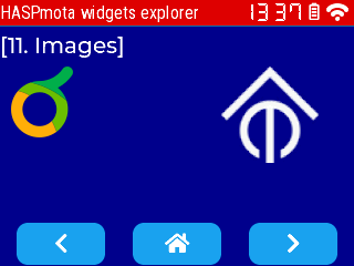
img~
Example:
{"id":11,"obj":"img","x":10,"y":60,"raw":"iVBORw0KGgoAAAANSUhEUgAAADgAAABACAYAAABP97SyAAAACXBIWXMAAAeDAAAHgwGiB5NRAAAAGXRFWHRTb2Z0d2FyZQB3d3cuaW5rc2NhcGUub3Jnm+48GgAACLxJREFUaIHVmntwlNUZxn/vt7tZArmQAALBVoTaoEIoeKOmSgIK4gwJCSRltE4VlBS0M9bWsTNOq0yn/YMynakdRSiO2kq9ACEbqEBVSORmqwGHS7202mpF0USQ3ZDs9Xv7xzqTkOzlfLtbC89MZjLved7Lk3O+L+d7zxFV5XyFtFW7OVm8FOwlIJcCMdD9IKu13rcbQM5XgfLHucMYNqQFuCHBsKI8oAt9vz5/BTbXrgWWpaAoMPu8FCjNtcuAtWmJyvbzTqBsmj8by9oOeAzoX1j/64JyCdm04DrEasZMHADnjUDZVDMHS3cgFDlwO3zOCxREpLnmXizZCgx16LzmnH4GZWNjKa7QeqAuA+/N1Psa3DmvKgeQlSstKg59D5euBkY5D8A79ISXKKrn1AzKuiYPo040YvMThG9lFETxY3O1NvjeATgnZlCaa6aDLGAkS1HKkIxD9WKxSBfGxcFXLFC23+ylW0pwu8rBmgo6FeUGkK/nIHwvQq3W+V46K2cul6i01E1E7Rko00Amgl0GMgLwAiXAsJwlOxsJxUEOZrCpTSYh1m2HeyaUF8iEym57yJj4iEIWa80BTmBLoy5q2ZNoMOMZXNEmCxTuA67rb49h/aszWvzRW6GLvP8MXTg1huXNKIEZ9uGmUWt8HycjOBa4fLdUYrEK5dp0XIXAF3bh4SPBCe53QxdWRNWV7yhZqtDCI3SOuV+XrY2kIhoLbNomQ6WAVQIryGDtKQQ+i5W8+dqZy0Z9Eh0xyal/H+QoYt+jda3tRmwTgStekQp18TyQRWF9iOJ++0jwos6O4KTpUdtl+uIJoDzMCP8jWrU7aporrcDlu2QWFs1AsWlQU6hy8v3I2CN7z0yd0qt5pWnoO8mP1Oq8F0NOcqQUuLxNFiM8jZLnJKhTCJw5HhnZsat72qRuzb8gBXUnMW+dNrzQaxw7mcAftMt8UZr5KjcDQs8H4TFvvBKYPi2MuzAJazf5kXmmM5lYYOuwabbt2viJFTtxKC+me7zhSX7RkVmU7giqnDwavPjogeDkb9sqiT5u12m9r8kk1mCBW4pGIHQAF/Wzxvxiv9nujfb+ZUjoqmh8Z5IKnwJ7gA4RPsXmc1vII/4cXyIwg/hPyjgxrH/s7L7K/2F49BWDR/VOrW99Ik0dCQT6ip9FdXEyB4Wug57I0efyQxXdlvZ/MYQQNmPz2Jpq3ZcucdPLUmx5aER5AJiYgqpd0eH7tnXPuDxo55X0swdRnaYLW99OledsgVuKahFa0hUHoIL/b3mRg38aGro6ovpqzOaetbP0PRPf/mjqEI8VoAn4OSm+/RTp2tMz5b2/B8df08+8Q+t981LF7xO4TjxcUHgMuMS4OiF4Suy7Smq6nzH2SYIfviRlMQ/NCtek4nVFi9t9/sorI7jj/z9F52td67Zk/L6ezAUFd+JEHJwmJtW5EAfwuxv1416oAjak4o10n555R+mOzjJ317G4RVbLypVJe0vxgZVigfzIQT29KPOoP/2aA5+0eLJKg5938n0g6YwAWNjja4r2l1cPPdSOUs7lHYna919yAaYWzcXZ0rybOv8BY74DvNCgsbCHW4Cjaaju8iH/mdlYtHtfnit6RzJSXKDYtxpXoLRS63/SmJ8BnqjUgCUsIf5RmRKl7kDlbSUvTb5p56ixicYttosXlfmGuSOo5WQpZ4xHZ+rrwPMmXA/RyRPyuhJqsAgXXg3G3eLnqP/ifUNu1pAYD6LYJlwV5iSyW9hUmmfk98bcHOCx2fo+gumzPiOR0cKSqYYBPiMc2G/IzRkUs40HMO6uV2T0QKOF6jcMA+ynQWPmpeUIMV40pXpcXDzQZiFcaOYuR8yryh3GungXIWxEFr420GShJPvuOhtqf+qstNzgoSqNonSacNUerMUChpilkm5HleUQKpwx4iXQYgFBoyyWGv4hcg9R43PBQZNgAX4jV5tBb6ivAo0bxYX5EdrpgQYL+MzI1bIuNS8rdxheykTSdxAAUOHzgTYL5J1E5MHeer2z0nIDy0XKD9oBGPR1bwFvGTqX0Tx8uoNkOYGA6T75+Noq7RpotJDYXuNsLr3LmJsDLN8l4wDTlXMokdHi1Jm9iOGbVHUprcWmO5/sYfEwhndiFP6cOMTtGkR52TClB5tfGnKzwordUg7cbkhXsdmaaCD+wav6B/PU2oCvcJE53znuOyD5KmzAvKu+f80sPZ5oIC7wdPdWMNsOAYLyNC3DEzRjc4OeII8CxvFF+G2ysbjA+DL9jXkJMhTsVloLKsx9DLBRXJGWotUFiJOLPx+MVrYkG+xrt7m8jwKDXrMpUIZt7aOlcKEDn+TYPqIIT2GrB368uMf7pqmbwi8eqtKk54V9Ams6A8BPHZZVALIRX9E6WoeVOfTtQ8vwOYQiHcDNAFdGPFO8KiYb7I6x7aRsgA04mxChpfBV4DvOq9QeRB4h5nqc+lMfpKW3iZtThTcB9yFUDxx+1RtpfzY/ODNFhKglXPtlcyopBh++tJSMh9hB4vdaMoENvAG0gRxF7Q8RVzeibmKMxMU3Ua4BnQ0kPZKzlRP3lgZKI8kOX5UH1lTrqnTFJD4f9BXNR2nh/3yfdHN+aP/L3nCi2xzbHq+iRkl/wSCxgFr/VtB7si0wW8wN5Q26oCDw17CHW0zEQaoZWhBYg/BgFvVljQJbKsbFrL4jOeFwOMTNT1RqwDRG6iVY6/8V8Ra68bWNHEMW9Xg/iv/GrkiQ6vVz9aSTAOmfsVr/k1+29k13OjlFue2u8CqP2QXc5FQcOLnK1TqsDNt6CuRGp0myQBfo3SwIvJBpAOeX8XyF30VlNZj2UzNCDGU9Uf0ZDYGsVk5mtw2fkiGUFCxB5X5gfDYFDEAYZQM2q1joT3m5wBTZXYjdKC7cRTcieitQg/kpVX/ENwYizxG2n8l2xgYidzd+28TN6aIrsPV6hMuActBxIIXAcOL91x7gE+DfKMcQfR1lD3UBs85eBvgvt7U0RJwz7ZIAAAAASUVORK5CYII="}
{"id":12,"obj":"img","x":200,"y":60,"scale":350,"src":"tasmota_logo","image_recolor":"#FFFFFF","image_recolor_opa":255}
using the following image: 
| Attribute name | LVGL equivalent | Details |
|---|---|---|
src | src | Path to the image in the file-system"tasmota_logo" to use the embedded logo in Flash. Note that this logo is black, so it needs to be recolored to white on dark background |
raw | You can embed directly a PNG image as a base64 string, instead of a file | |
image_recolor | style_image_recolor | Color used to recolor the image |
image_recolor_opa | style_image_recolor_opa | Opacity of image recoloring0: no recolor255: full recolor |
scalescale_xscale_y | scale | Zoom value, 256 (default) is no zoom, 128 is half size, 256 is double sizescale_x and scale_y can be used to the scale independently horizontally and vertically (non-uniform scale) |
angle | angle | Angle of the image, in 1/10th of degrees. Range 0..3600 |
antialias | antialias | true (defaul) the transformations are higher quality but slower |
Example of code to convert an image to base64:
f=open('logo-berry.png')
raw=f.readbytes()
f.close()
f=open('logo-bery.b4','w')
f.write(raw.tob64())
f.close()
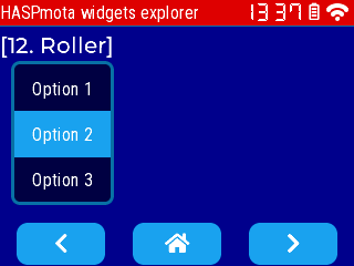
roller~
Example:
{"id":11,"obj":"roller","x":10,"y":55,"options":"Option 1\nOption 2\nOption 3\nOption 4","val":1}
| Attribute name | LVGL equivalent | Details |
|---|---|---|
options | options | (string) options separated by \n |
val | The number of the selected item, 0 (default) is the first item | |
bg_color50 | Background color of the selected item | |
text_color | Text color of non-selected options | |
text_color50 | Text color of the selected options | |
text | selected_text | (read-only) Get the text of the currently selected item. The string is truncated to the first 256 bytes. |
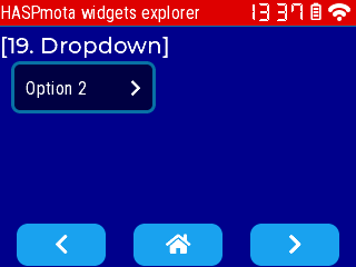
dropdown and dropdown_list~
Example:
{"id":11,"obj":"dropdown","x":10,"y":55,"direction":3,"options":"Option 1\nOption 2\nOption 3\nOption 4","val":1}
  {"id":12,"obj":"dropdown_list","parentid":11,"h":90}
| Attribute name | Details |
|---|---|
options | (string) options separated by \n |
val | The number of the selected item, 0 (default) is the first item |
direction | Direction of the dropdown, the arrow symbol is automatically adjusted0: down1: up2: left3: right |
bg_color50 | Background color of the selected item |
text_color | Text color of non-selected options |
text_color50 | Text color of the selected options |
text | (read-only) Get the text of the currently selected item. The string is truncated to the first 256 bytes. |
If you want to apply style to the list sub-object, you can define a dropdown_list with parentid referring to the dropdown object.
| Attribute name | Details |
|---|---|
options | (string) options separated by \n |
bg_color51 | Background color of the selected item |
text_color | Text color of non-selected options |
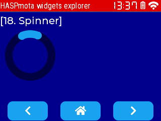
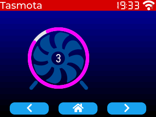
spinner~
Example:
{"id":11,"obj":"spinner","x":10,"y":60,"w":100,"h":100,"angle":200,"speed":5000,"arc_color":"#000044","arc_color10":"#1FA3EC"}
| Attribute name | LVGL equivalent | Details |
|---|---|---|
angle | The length of the spinning segment in degrees - can be changed after initial value since v12.1.1.1 | |
speed | The time for 1 turn in ms - can be changed after initial value since v12.1.1.1 |
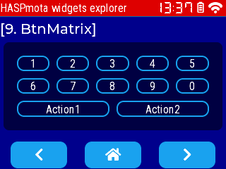
btnmatrix~
Example:
Example from pages.jsonl:
{"id":11,"obj":"btnmatrix","x":5,"y":60,"w":310,"h":125,"bg_color":"#000044","options":["1","2","3","4","5","\n","6","7","8","9","0","\n","Action1","Action2"],"border_color30":"#1FA3EC","border_width30":2,"bg_color30":"#000044","text_color30":"#FFFFFF","border_color":"#000044"}
| Attribute name | LVGL equivalent | Details |
|---|---|---|
options | (json array) Array of strings where each element is the label of a button. Use "\n" for a new line of buttons, and end with an empty string "" | |
border_color | Color of the overall border | |
border_color30 | Color of the border of each button | |
border_width30 | Border width of each button | |
text_color30 | Color of the inner text of each button |
For btnmatrix, events generated contain an addtional suffix to indicate which button was pressed or released.
Example: p9b11_0 means page 9, object id 11, button 0
xx:xx:25.131 {'hasp': {'p9b11_0': {'event': 'changed'}}}
xx:xx:25.134 {'hasp': {'p9b11_0': {'event': 'down'}}}
xx:xx:25.520 {'hasp': {'p9b11_0': {'event': 'long'}}}
xx:xx:25.670 {'hasp': {'p9b11_0': {'event': 'changed'}}}
xx:xx:25.735 {'hasp': {'p9b11_0': {'event': 'release'}}}
xx:xx:25.737 {'hasp': {'p9b11_0': {'event': 'up'}}}
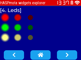
led~
Example:
Example from pages.jsonl:
{"id":11,"obj":"led","x":10,"y":60,"w":20,"h":20,"color":"#FF0000"}
{"id":12,"obj":"led","x":60,"y":60,"w":20,"h":20,"color":"#FF0000","val":200}
{"id":13,"obj":"led","x":110,"y":60,"w":20,"h":20,"color":"#FF0000","val":0}

{"id":21,"obj":"led","x":10,"y":100,"w":20,"h":20,"color":"#00FF00"}
{"id":22,"obj":"led","x":60,"y":100,"w":20,"h":20,"color":"#00FF00","val":200}
{"id":23,"obj":"led","x":110,"y":100,"w":20,"h":20,"color":"#00FF00","val":0}

{"id":31,"obj":"led","x":10,"y":140,"w":20,"h":20,"color":"#FFFF88"}
{"id":32,"obj":"led","x":60,"y":140,"w":20,"h":20,"color":"#FFFF88","val":200}
{"id":33,"obj":"led","x":110,"y":140,"w":20,"h":20,"color":"#FFFF88","val":0}
| Attribute name | LVGL equivalent | Details |
|---|---|---|
valbrightness | set_brightness | The brightness from 0 (off) to 255 (on) |
color | set_color | The overall color of the led |
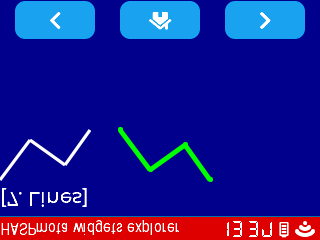
line~
Example:
Example from pages.jsonl:
{"id":11,"obj":"line","x":0,"y":60,"w":100,"h":50,"line_width":3,"points":[[0,0],[30,40],[65,15],[90,50]]}
{"id":12,"obj":"line","x":120,"y":60,"w":100,"h":50,"line_color":"#00FF00","line_width":5,"points":[[0,0],[30,40],[65,15],[90,50]],"y_invert":true,"line_rounded":true}
| Attribute name | LVGL equivalent | Details |
|---|---|---|
points | (JSON array) Array of 2-value arrays, each entry is a point Ex: [[0,0],[30,40],[65,15],[90,50]] | |
line_rounded | (bool) Make the end points of the lines rounded. true: rounded, false: perpendicular line ending | |
y_invert | (bool) false: y == 0 point is in the top of the objecttrue: y == 0 will be the bottom of the object |
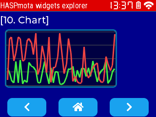
chart~
This object is not part of OPENhasp.
The chart object allows to track values over time and show them in a graph.
Example of pages.jsonl:
{"page":10,"id":10,"obj":"chart","x":10,"y":60,"w":230,"h":120,"pad_all":2,"y_min":0,"y_max":50,"point_count":50,"height10":0,"width10":0,"v_div_line_count":0,"h_div_line_count":5,"line_color":"#555555","line_width30":3}

{"comment":"--- Add random values to chart every second ---","berry_run":"tasmota.add_cron('*/1 * * * * *', def () import math var val = math.rand() % 50 global.p10b10.val = val val = math.rand() % 50 global.p10b10.val2 = val end, 'hm_every_1_s_chart')"}
You can also add values programmatically:
global.p10b10.val = 10
global.p10b10.val = 40
global.p10b10.val = 30
global.p10b10.val = 40
global.p10b10.val = 20

global.p10b10.val2 = 45
global.p10b10.val2 = 35
global.p10b10.val2 = 55
global.p10b10.val2 = -5
global.p10b10.val2 = 25
| Attribute name | LVGL equivalent | Details |
|---|---|---|
x_minx_maxy_min or y2_miny_max or y2_max | set_range | Set the minimum and maximum values for x or y scales. Default are 0..100 for both axis.y2_min and y2_max control the range for the second data series. |
point_count | point_count | Set the number of points to display in the chart. Default is 10. Changing this value clears the content of the chart. |
height10width10 | Set the height and width for dots for each value. Set to 0 to remove dots and live only lines. | |
v_div_line_counth_div_line_count | div_line_count | Set the number of division lines vertically and horizontally. Detault for v_div_line_count is 5, for h_div_line_count is 3.Change the division line color with line_color. |
type | chart_type | Change the chart type.0: Don't draw the series1 (LINE): Connect the points with lines2 (BAR): Draw columns.3 (SCATTER): Draw points and lines in 2D (x,y coordinates). |
series1_colorseries2_color | set_series_color | Sets the color for each series |
valval2 | Add a value to the fist series with val and to second series with val2. | |
zoom_xzoom_y | zoom | Zoom into the chart in X or Y direction.256 for no zoom, 512 double zoom. |
update_mode | update_mode | Set update mode of the chart object, default is SHIFT.0: (SHIFT) Shift old data to the left and add the new one the right1: (CIRCULAR) Add the new data in a circular way |
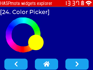
cpicker~
The cpicker (color picker) object allows to select a color, encoded as #RRGGBB where RR/GG/BB are Hex values for Red/Green/Blue. Color Picker has 3 modes: "hue", "saturation", "value"; use long press to change mode.
Example of pages.jsonl:
{"id":10,"obj":"cpicker","x":20,"y":60,"w":120,"h":120,"color":"#FFFF00","mode":"hue","scale_width":20}
| Attribute name | LVGL equivalent | Details |
|---|---|---|
color | color_rgb | Set or read the current color as #RRGGBB string, where Red/Green/Blue are encoded as 2-digit hex. Example: #FFFF00 is yellow. |
mode | mode | Set or read the current modehue displays a hue ringsaturation displays a saturation ring from 0 to whitevalue displays a brightness ring from pure color to black |
mode_fixed | mode_fixed | (bool) Set or read the mode_fixed attribute. If true, there is no mode change on long-press. |
scale_width | arc_width | (int) Set or read the width of the ring |
pad_inner | This attribute is ignored but present for OpenHASP compatibility. Since LVGL 8, there is no inner circle showing the color. There color is shown on the knob instead |
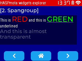
spangroup (styled text)~
Available (since Tasmota v13.4). This object is not part of OPENhasp.
The spangroup object is equivalent to HTML <span> and allows to have a text area composed of multiple fragments, each fragment with its own style, size, font, color...
Example:
{"id":11,"obj":"spangroup","x":0,"y":60,"w":300,"h":115,"text_font":"robotocondensed-16","bg_color":"#000044","bg_opa":255}
  {"id":12,"obj":"span","parentid":11,"text":"This is "}
  {"id":13,"obj":"span","parentid":11,"text":"RED","text_color":"#FF0000","text_font":"montserrat-28"}
  {"id":14,"obj":"span","parentid":11,"text":" and this is "}
  {"id":15,"obj":"span","parentid":11,"text":"GREEN","text_color":"#00FF00","text_font":"montserrat-28","text_decor":1}
  {"id":16,"obj":"span","parentid":11,"text":" underlined"}
  {"id":17,"obj":"span","parentid":11,"text":"\nAnd this is almost transparent","text_opa":100,"text_font":"montserrat-20"}
You must first define a spangroup object, and add as many as span sub-objects. You need to define the parentid attribute to the spangroup.
Note: span are parsed in the order in the jsonl file, not by id number. Text from span can be updated via rules, like normal HASPmota text.
| Attribute name | LVGL equivalent | Details |
|---|---|---|
parentid | Set to the id of the spangroup it belongs to | |
align | set_align | Similar to label object0: (default) align auto1: align left2: align center3: align right |
mode | set_mode | Display modes:0: fixes the object size1: expand the object size to the text size but stay on a single line2: (default) keep width, break the too long lines and auto expand height |
overflow | set_overflow | Trucature modes:0: (default) truncates the text at the limit of the area1: will display an ellipsis (...) when text overflows the area |
indent | set_indent | Set the indent of the first line in pixels |
max_lines | set_max_lines | Set the maximum number of lines to be displayed in mode=2, negative values indicate no limit |
Each span sub-object must have an explicit parentid to the spangroup, and accepts only the following attributes (mostly from lv_style):
| Attribute name | LVGL equivalent | Details |
|---|---|---|
text | set_text | Sets the text of the span element, use \n for a new line |
text_color | set_text_color | Sets the color of text |
text_decor | set_text_decor | Sets the text decorator, can be ORed0: none1 underline2: strike-through |
text_opa | set_text_opa | Sets the text opacity0: transparent255: opaque |
text_letter_space | set_text_letter_space | Set the letter space in pixels |
text_line_space | set_text_line_space | Set the line space in pixels. |
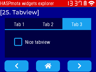
tabview~
Available (since Tasmota v14.4.2).
The tabview can be used to organize content in tabs.
Example:
{"id":10,"obj":"tabview","x%":5,"y":60,"h%":55,"w%":90,"tab_bar_size":40,"btn_pos":1,"val":2}
  {"id":51,"obj":"tab","parentid":10,"text":"Tab 1"}
  {"id":52,"obj":"tab","parentid":10,"text":"Tab 2"}
  {"id":53,"obj":"tab","parentid":10,"text":"Tab 3"}
    {"id":61,"obj":"switch","x":20,"y":10,"w":60,"h":30,"parentid":51,"radius":25,"radius20":25}
    {"id":71,"obj":"dropdown","x":15,"y":10,"w":110,"h":30,"parentid":52,"options":"Apple\nBanana\nOrange\nMelon"}
      {"id":72,"obj":"dropdown_list","parentid":71}
    {"id":81,"obj":"checkbox","x":15,"y":10,"w":150,"h":30,"parentid":53,"text":"Nice tabview"}
You must first define a tabview object, and add as many as tab sub-objects. You need to define the parentid attribute to the tabview. Sub-objects are then placed within each tab as long as you define parentid to the tab.
tabview Attribute name | LVGL equivalent | Details |
|---|---|---|
tab_bar_size | tab_bar_size | (write-only) Set the vertical size of tab buttons. |
bg_color | bg_color | Set the background color for the content background of the sub-tabs |
val | Set or read the index of the active tab (0..count-1). | |
count | (read-only) Read the number of tabs | |
text | (read-only) Read the label of the active tab | |
border_color | border_color | Set the color of the overall border of tabview. |
border_width | border_width | Set the border size of the overall border of tabview. |
tab Attribute name | LVGL equivalent | Details |
|---|---|---|
parentid | Set to the id of the tabview it belongs to. | |
text | Set the title of the tab button; cannot be changed once the tab is created. | |
tab_bg_color | Set the background color of the tab button when it is not selected. | |
tab_bg_color01 | Set the background color of the tab button when it is selected. | |
tab_text_color | Set the text color of the tab button when it is not selected. | |
tab_text_color01 | Set the text color of the tab button when it is selected. | |
tab_radius | Set the radius of the tab button. Set to 0 by default for rectangular tab buttons. |
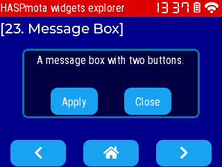
msgbox~
The msgbox (message box) object allows to display a pop-up with a text content and one or multiple buttons. The pop-up can be made "modal" (not impemented yet).
Example of pages.jsonl:
{"id":10,"obj":"msgbox","x":0,"y":0,"w%":80,"h":100,"text":"A message box with two buttons.","options":["Apply","Close"]}
| Attribute name | LVGL equivalent | Details |
|---|---|---|
text | content | Set the contect of the Message box. If you write a new value, it will add to the existing content (LVGL limitation) |
options | (array of string, not empty) Labels for buttons | |
footer_<X>header_<X>title_<X>content<X>buttons_<X> | Prefix to set or read style attributes on sub-objects of the message box. Styles for buttons_ cannot be read, and set the same style for all buttons. | |
border_color | Set the color of the border of the pop-up. | |
text_color | Set the text color of the content | |
bg_opa | Set the opacity of the pop-up, 255 (fully opaque) by default. | |
buttons_bg_color | Set the background color of all buttons. | |
buttons_border_width | Set the border width of all buttons. | |
buttons_border_color | Set the border color of all buttons. |
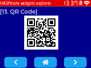
qrcode~
Example:
{"id":11,"obj":"qrcode","qr_text":"https://tasmota.github.io/","x":85,"y":55,"qr_size":120}
| Attribute name | LVGL equivalent | Details |
|---|---|---|
qr_size | Size in pixels of the QRCode, always square (height = width). This cannot be changed once the object is created. | |
qr_dark_color | Color used for the dark pixels. This cannot be changed once the object is created. | |
qr_light_color | Color used for the light pixels. This cannot be changed once the object is created. | |
qr_text | (mandatory) String to encode as a QRCode, can be changed at any moment. |
HASPmota styling~
Since v13.2.0.1, HASPmota includes styling extensions replicating OpenHASP Styling Properties.
Styling attributes can include a 2-digit suffix to indicate which element and which state the styling attributes refers to:
The part indexes are:
- 00 = main part of the object (i.e. the background)
- 10 = the indicator or needle, highlighting the the current value
- 20 = the knob which can be used the change the value
- 30 = the background of the items/buttons
- 40 = the items/buttons (not implemented yet)
- 50 = the selected item
- 60 = major ticks of the gauge object
- 70 = the text cursor
- 80 = the scrollbar
- 90 = other special part, not listed above
The state indexes:
- 00 = default styling
- 01 = styling for toggled state
- 02 = styling for pressed, not toggled state
- 03 = styling for pressed and toggled state
- 04 = styling for disabled not toggled state
- 05 = styling for disabled and toggled state
A toggle btn can be made to show text yellow when toggled ON with "text_color":"white","text_color01":"yellow"
The following attributes accept styling suffix:
radiusborder_sideborder_widthborder_colorline_widthbg_colorbg_grad_colorbg_grad_dirline_colorpad_leftpad_rightpad_toppad_bottompad_alltext_color
Tasmota extensions~
Auto-dimming~
HASPmota has an auto-dimming features that triggers after a period of inactivity (i.e. no touch on the screen). The screen is first dimmed to lower brightness after dimming_time minutes and turned off after dimming_duration seconds. When dimmed or off, touch events are disabled, to prevent pressing on an invisible button and triggering unwanted behavior.
Parameters are associated to p0b0 (page 0 item 0):
{"page":0,"id":0,"dimming_time":1,"dimming_min":35,"dimming_duration":30}
Parameters:
dimming_timenumber of minutes before changing from full brightness to 1/4 brightness. Default:0= off.dimming_durationnumber of seconds before turning screen off. Default30secondsdimming_minminimum visible value for DisplayDimmer that keeps the screen on. Default1. This used for screen that turn off the backlighting whenDisplayDimmeris under a certain value.
Events sent:
{"hasp":{"p0b0":{"idle":"short"}}}is sent when dimming is enabled{"hasp":{"p0b0":{"idle":"long"}}}is sent when screen is turned off{"hasp":{"p0b0":{"idle":"off"}}}is sent when screen is turned on again after a press on the screen
Update sensor value via rules~
You can automatically adjust attributes val and text from sensor values via a simple rule engine.
| attribute | description |
|---|---|
| val_rule | Rule pattern to trigger an update of the val attribute.Example: "val_rule":"ESP32#Temperature" |
| val_rule_formula | Optional expression (using Berry) to transform the value extracted from the rule to the value pushed to val. This typically allows to adjust ranges of values.Input value is always converted to float not int. The input value is named val.Example: "val_rule_formula":"val / 1000" |
Changing a text attribute from rules:
| attribute | description |
|---|---|
| text_rule | Rule pattern to trigger an update of the text attribute.Example: "text_rule":"ESP32#Temperature" |
| text_rule_formula | Optional expression (using Berry) to transform the value extracted from the rule to the value pushed to val. This typically allows to adjust ranges of values.Input value is always converted to float not int. The input value is named val.Example: "val_rule_formula":"val * 10" |
| text_rule_format | String format of the result string. The format uses Berry's string.format(), which is a subset of printf format.Example: "text_rule_format":"%2.1f °C" |
React to user actions~
Every time the user touches an active element on the screen, HASPmota publishes internal events you can listen and react to. For example if you press a button p1b10, HASPmota publishes an event {"hasp":{"p1b10":{"event":"up"}} when the button is released. You can easily create a rule to react to this event.
Example:
tasmota.add_rule("hasp#p1b10#event=up", / -> print("Button p1b10 pressed"))
Events with value changed indicate that the value of the widgets has changed. Events are only fired if the change in value comes from a screen interaction. No event is fired when the value was changed programmatically. The new value is sent as val attribute, and for specific widgets (roller) a text attribute is sent for the label of the value. {"hasp":{"p1b1":{"val":3,"text":"A3","event":"changed"}}}
Example:
tasmota.add_rule("hasp#p1b1#text", / text-> print("p1b1 text value=", text))
Run arbitrary Berry code~
Inserting an attribute berry_run to any object will compile and run the embedded Berry code right after widget initialization. If you need the current widget object, it requires a special construct like: "berry_run":"return def (x) print(x) end"
One common use is to trigger sensors read every 2 seconds:
{"comment":"--- Trigger sensors every 2 seconds ---","berry_run":"tasmota.add_cron('*/2 * * * * *', def () tasmota.publish_rule(tasmota.read_sensors()) end, 'oh_every_5_s')"}
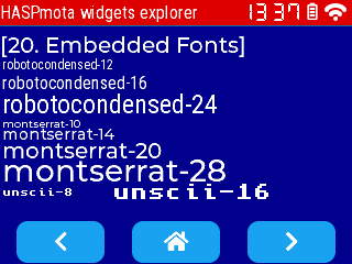
HASPmota fonts~
HASPmota can use 3 types of LVGL fonts:
- embedded fonts, i.e. fonts included in Tasmota firmware
- binary bitmat fonts (extension
.lvfont), stored in the Tasmota file-system usinglv_font_convtool. Tasmota includes various fonts pre-converted - TrueType fonts (extension
.ttf), stored in the Tasmota file-system. TrueType vector fonts can be scaled at any size and render well at high font-sizes, but require significant PSRAM memory. Bitmaps TrueType (BDF) are now supported since Tasmota v13.4
Embedded fonts~
Use attribute like "text_font":"<font_name>-<font_size>". The default is "text_font":"robotocondensed-16"
| Embedded font | Details |
|---|---|
robotocondensed-12robotocondensed-16robotocondensed-24 | Default OpenHASP |
montserrat-10montserrat-14montserrat-20montserrat-28 | Default LVGL normal font, including icons |
unscii-8unscii-16 | Default LVGL, 8 px and 16 px pixel perfect font with only ASCII characters |
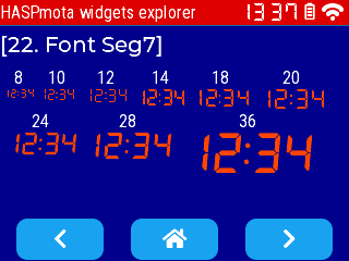
seg7-8seg7-10seg7-12seg7-14seg7-16seg7-18seg7-20seg7-24seg7-28seg7-36seg7-48 | 7 segments display, contains digits, space, ':' and '!' for a space of the size of ':' Sizes 8, 10, 12, 14, 16, 18 are pixel-perfect bold Sizes 20, 24, 28, 36, 48 are dithered (2 bits per pixel) bold-italic |
Embedded symbols~
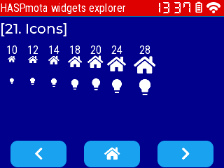
HASPmota combines icons from LVGL and from OpenHASP.
You can use the following icons fonts:
| Embedded font | Details |
|---|---|
icons-10 | Also contained in montserrat-10 |
icons-12 | |
icons-14 | Also contained in montserrat-14 |
icons-18 | |
icons-20 | Also contained in montserrat-20 |
icons-24 | |
icons-28 | Also contained in montserrat-28 |
Embedded special fonts~
The font seg7 is used to look like 7-segment display. To improve readability, sizes up to 20 are straight, and sizes above 24 are slightly italic.
| Embedded font | Details |
|---|---|
seg7-8seg7-10seg7-12seg7-14seg7-16seg7-18seg7-20seg7-24seg7-28seg7-36seg7-48 | 7 segments display, contains digits, space, ':' and '!' for a space of the size of ':' Sizes 8, 10, 12, 14, 16, 18 are pixel-perfect bold Sizes 20, 24, 28, 36, 48 are dithered (2 bits per pixel) bold-italic |
Binary bitmap fonts~
Files of extension .lvfont, they are similar to embedded fonts but can be loaded dynamically from the file-system.
Generally speaking, binary bitmap fonts are mostly used for low resolution font, or they take too much memory. For larger font, prefer TrueType fonts (see below).
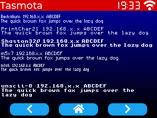
Pixel-perfect fonts~
Pixel-perfect fonts don't use dithering and are specially designed for low resolution monochrome displays.
example: 
Same image zoomed x2 
unscii-8 (bottom font) is embedded by default.
To use the other fonts, add the corresponding file to the Tasmota file system.
Fonts below are from KreativeKorp
Berkelium64.lvfontBerkelium (BSW) GEOS System FontPrintChar21.lvfontThe Ultimate Apple II FontShaston320.lvfontShaston GS/OS System Font
Fonts below are from Daniel Linssen
m5x7.lvfonthttps://managore.itch.io/m5x7m3x6.lvfonthttps://managore.itch.io/m3x6
Here is the HASPmota template for the screen above:
{"page":0,"comment":"---------- Upper stat line ----------"}
{"id":0,"text_color":"#FFFFFF"}
{"id":11,"obj":"label","x":0,"y":0,"w":320,"pad_right":90,"h":22,"bg_color":"#D00000","bg_opa":255,"radius":0,"border_side":0,"text":"Tasmota","text_font":"montserrat-20"}

{"id":15,"obj":"lv_wifi_arcs","x":291,"y":0,"w":29,"h":22,"radius":0,"border_side":0,"bg_color":"#000000","line_color":"#FFFFFF"}
{"id":16,"obj":"lv_clock","x":232,"y":3,"w":55,"h":16,"radius":0,"border_side":0}

{"page":1,"comment":"---------- Page 1 ----------"}
{"id":5,"obj":"label","x":2,"y":30,"w":316,"text":"Berkelium 74192.168.x.x ABCDEF\nThe quick brown fox jumps over the lazy dog","text_font":"A:Berkelium64.lvfont"}
{"id":6,"obj":"label","x":2,"y":55,"w":316,"text":"PrintChar21 192.168.x.x ABCDEF\nThe quick brown fox jumps over the lazy dog","text_font":"A:PrintChar21.lvfont"}
{"id":7,"obj":"label","x":2,"y":80,"w":316,"text":"Shaston320 192.168.x.x ABCDEF\nThe quick brown fox jumps over the lazy dog","text_font":"A:Shaston320.lvfont"}
{"id":8,"obj":"label","x":2,"y":105,"w":316,"text":"m5x7 192.168.x.x ABCDEF\nThe quick brown fox jumps over the lazy dog","text_font":"A:m5x7.lvfont"}
{"id":9,"obj":"label","x":2,"y":130,"w":316,"text":"m3x6 192.168.x.x ABCDEF\nThe quick brown fox jumps over the lazy dog","text_font":"A:m3x6.lvfont"}

{"id":99,"obj":"label","x":2,"y":170,"w":316,"text":"unscii-8 192.168.x.x ABCDEF\nThe quick brown fox jumps over the lazy dog","text_font":"unscii-8"}
TrueType fonts~
Add support for TTF fonts in HASPmota. The attributes needs to specify the font name and the size "text_font":"sketchbook.ttf-32"
Example:

Related pages.jsonl file:
{"page":0,"comment":"---------- Upper stat line ----------"}
{"id":0,"text_color":"#FFFFFF"}
{"id":11,"obj":"label","x":0,"y":0,"w":320,"pad_right":90,"h":22,"bg_color":"#D00000","bg_opa":255,"radius":0,"border_side":0,"text":"Tasmota","text_font":"montserrat-20"}

{"id":15,"obj":"lv_wifi_arcs","x":291,"y":0,"w":29,"h":22,"radius":0,"border_side":0,"bg_color":"#000000","line_color":"#FFFFFF"}
{"id":16,"obj":"lv_clock","x":232,"y":3,"w":55,"h":16,"radius":0,"border_side":0}

{"page":1,"comment":"---------- Page 1 ----------"}
{"id":1,"obj":"label","x":2,"y":40,"w":316,"text":"sketchbook-32\n192.168.x.x ABCDEF\nThe quick brown fox jumps over the lazy dog","text_font":"sketchbook.ttf-32"}